We all love the color that we use in our paper crafts. Who doesn't love the rich colors and textures of our cards stock. There are so many hues and colors ! I love them all !
Who doesn't want to add the the color range of our inks? Even if you think you have enough, someone comes with a new gotta have it new color?
Paints go through a lot of shades from simple water colors to the range of unlimited colors.
Does anyone have enough shades of glitter? Yipes, I never get enough variations.
So whatever the product, every company has it's own variations of shades and colors.
So, why is color theory so important anyway? Well. if you were using alcohol inks on an art journal page, and yellow and red ran into each other, you might get an unexpected orange that you really didn't want.
Or if you were creating a scrapbook page and you used opposing colors, you might lose the picture, because the eye was drawn to the confusing colors rather than the photo.
So, let's talk about some simple color theory. We have simplified it to to relevant to paper crafts.


These are ways that you can think about color when you are creating your greeting cards, art journals and scrap book pages
Who doesn't want to add the the color range of our inks? Even if you think you have enough, someone comes with a new gotta have it new color?
Paints go through a lot of shades from simple water colors to the range of unlimited colors.
Does anyone have enough shades of glitter? Yipes, I never get enough variations.
So whatever the product, every company has it's own variations of shades and colors.
So, why is color theory so important anyway? Well. if you were using alcohol inks on an art journal page, and yellow and red ran into each other, you might get an unexpected orange that you really didn't want.
Or if you were creating a scrapbook page and you used opposing colors, you might lose the picture, because the eye was drawn to the confusing colors rather than the photo.
So, let's talk about some simple color theory. We have simplified it to to relevant to paper crafts.
Basic Color Wheel

Here is the basic color wheel. There are tons of variations in between these colors, but these are the basic colors in their most simplistic form.
But what compliments each of these colors is what is important to us as paper crafters. Does it mean that you cannot use other colors? Of course not. It just means that these are the best matches.

Remember, that within these colors are hundreds of special hues or color variants. Each company and brand has a palette of it's own.
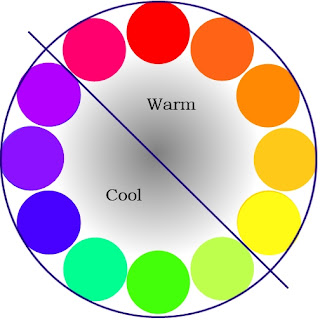
Cool Vs Warm Colors

Cool colors tend to have a more calming effect. They make you feel relaxed.
Blue-is a strong important color that cab also be peaceful or signify intelligance.
Green is more like growth, harmony, health and envionment
Warm colors can run from simple optimism to strong violence. They give you energy.
Red is all about love, passion, heat, joy and power
Pink is about romantic, playful, nice sweet and delicate
Yellow is happy, joyful, cheerful and for rembrance
Gold represents riches extravagence,and brightness.
Orange is energy, warmth and health
Here is another way to think about warm and cool colors in your paper crafts
Free Color Wheels And Charts
There are many free charts available online that will help you with your color choices. Here are a few of my personal favorites.
Comments
Post a Comment
We would love to hear your thoughts, ideas, or just say hello. We appreciate your time here today. Thank you for stopping by!